
Theming
You can align Managed Bill Pay with your brand in either of these ways—use one or both:
- Unit Dashboard — Tune the theme in the Managed Solutions branding UI, preview the Managed Solution component, and save. No code required for experimentation. This option requires banking in addition to bill pay.
- Your embed — Pass a theme object on the Managed Solution component (
unit-elements-white-label-app) via thesettings-jsonattribute so styling is versioned with your app or driven at runtime.
Both approaches use the same underlying theme model. See the theming guide for the full theme shape, tokens, and supported properties.
Option 1: Adjust the theme in the Dashboard
This option requires banking in addition to bill pay.
Open the Managed Solutions branding page in the Unit Dashboard to change colors (including semantic colors), upload a logo, adjust container styles, and see a live preview of the Managed Solution component. When you are satisfied, use Save Changes.
| Environment | Link |
|---|---|
| Sandbox | app.s.unit.sh/managed-solutions/branding |
| Live | app.unit.co/managed-solutions/branding |
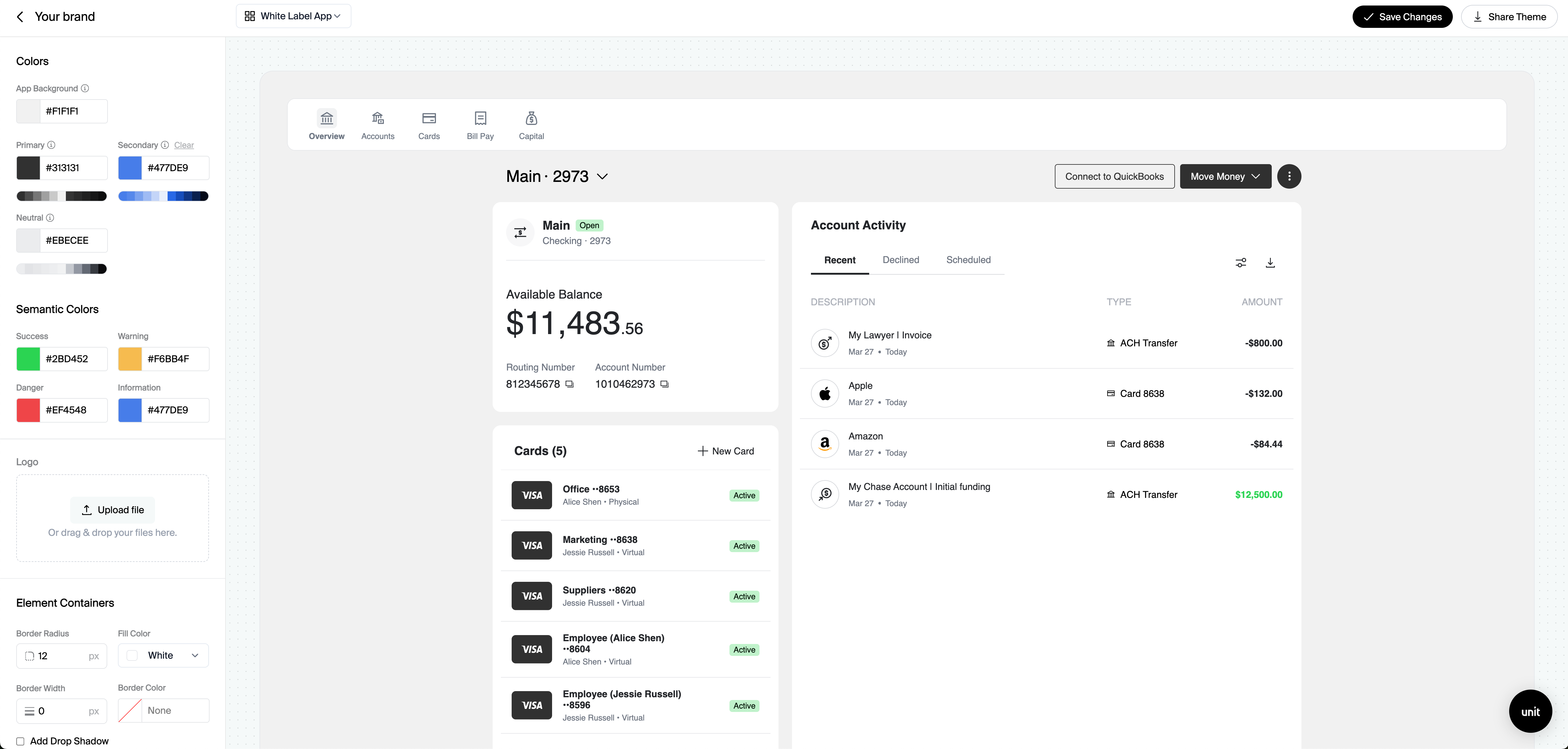
Option 2: Pass a theme via settings-json on the component
To control branding from your application, pass a JSON string on settings-json that includes your theme (and any other supported settings). The Managed Solution component reads that object when it loads—useful when you want themes per environment, per customer, or managed in source control.
Example shape (see the theming guide for all options):
<unit-elements-white-label-app
  jwt-token="{{JwtToken}}"
  settings-json='{"theme": { /* colors, logos, typography, etc. */ }}'
></unit-elements-white-label-app>
If you prototype in the Dashboard first, you can translate the same visual choices into the JSON you pass on settings-json.